A full-stack ecommerce experience refined around product discovery and reliable store behavior
Visit Live Project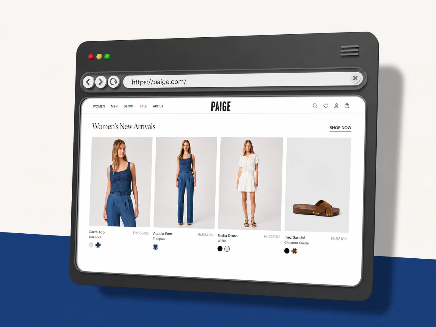
Project brief
From business need to delivered system
| Area | Project detail |
|---|---|
| Business need | A polished ecommerce storefront that could support discovery, product confidence, and future merchandising. |
| Product response | A full-stack product experience connecting product-led UI with store data and workflows. |
| Delivery result | A clearer browsing foundation with more dependable ecommerce behavior behind it. |
Business need
A polished ecommerce storefront that could support discovery, product confidence, and future merchandising.
Product response
A full-stack product experience connecting product-led UI with store data and workflows.
Delivery result
A clearer browsing foundation with more dependable ecommerce behavior behind it.
Stack used
The challenge
What Paige needed the build to solve
A premium storefront has to balance visual presentation with practical shopping behavior. The challenge was to keep product discovery polished while making sure the underlying catalog, collection, and store workflows could support a reliable experience across devices.
Project facts
| Project type | Ecommerce |
|---|---|
| Responsibility | UI/UX, frontend, backend, database, and ecommerce workflows |
| Coverage | Public storefront and private owner dashboard |
| Technology | Next.js, React, TypeScript, Tailwind CSS, Node.js, PostgreSQL |
The approach
How I handled the Paige delivery
I organized the experience around product discovery: collection entry, browsing, product consideration, supporting information, and the actions that move a shopper forward.
The UI/UX work gave products and collections stronger visual priority while keeping navigation, responsive behavior, and content hierarchy practical.
Backend and database-connected flows were aligned with the storefront so product records, collection content, and store behavior could remain consistent.
Reusable merchandising and product patterns were kept central so future catalog, campaign, and content updates could be introduced without rebuilding the experience.
System structure
The structure behind Paige
The delivery connected the user-facing experience with the underlying implementation, keeping the project clear to use and practical to maintain as its needs expanded.
Product discovery
Collections, browsing, product detail, and shopper-facing context.
Storefront experience
Product-led responsive UI, merchandising blocks, and action paths.
Backend + database
Connected product records and store behavior supporting the experience.
What was delivered
The practical output of the build
| Area | Project detail |
|---|---|
| Ecommerce UX | Product-led discovery, collection browsing, responsive merchandising, and clear action points. |
| Storefront frontend | Reusable product, collection, content, and responsive shopping interface components. |
| Backend + data | Connected product records, store logic, and database-backed ecommerce behavior. |
| Growth foundation | A flexible structure for catalog, campaign, and merchandising updates. |
Ecommerce UX
Product-led discovery, collection browsing, responsive merchandising, and clear action points.
Storefront frontend
Reusable product, collection, content, and responsive shopping interface components.
Backend + data
Connected product records, store logic, and database-backed ecommerce behavior.
Growth foundation
A flexible structure for catalog, campaign, and merchandising updates.
Delivery coverage
The shape of the work
Discovery
Product-led
Frontend
Complete
Backend
Connected
Data
Structured
Technical implementation
What had to work behind the interface
The storefront was designed around product discovery and reusable merchandising patterns rather than one-off promotional sections.
Frontend and backend behavior were kept aligned so product and collection information could remain consistent as the store evolved.
The full-stack structure gave the ecommerce experience a stronger base for future catalog changes, campaigns, and connected shopping workflows.
Tools used
| Next.js | Full-stack ecommerce structure, routing, and responsive storefront delivery. |
|---|---|
| React | Reusable product, collection, merchandising, and shopping components. |
| Node.js | Backend store logic and connected ecommerce workflows. |
| PostgreSQL | Structured data foundation for product and ecommerce records. |
| TypeScript | More predictable component and data structure for maintainable product work. |
Outcomes
What the Paige delivery achieved
Paige received a more focused product-discovery experience that balanced brand presentation with shopping clarity.
The connected frontend and backend created a more dependable foundation for products, collections, and store behavior.
The reusable structure left room for future catalog, campaign, and merchandising growth.
Why this matters
Product-led discovery.
Full-stack ecommerce delivery.
Connected store data.
Flexible merchandising foundation.
Reference note
This case study focuses on the full-stack ecommerce, UI/UX, product discovery, backend, and database-connected work delivered for Paige. Private commerce providers and business metrics are intentionally omitted.
Continue exploring
More ways to explore Paige.
Compare related case studies, understand the services behind this delivery, or start a conversation about your own build.
Next Step