A community frontend shaped around discovery, visibility, and repeat engagement
Visit Live Project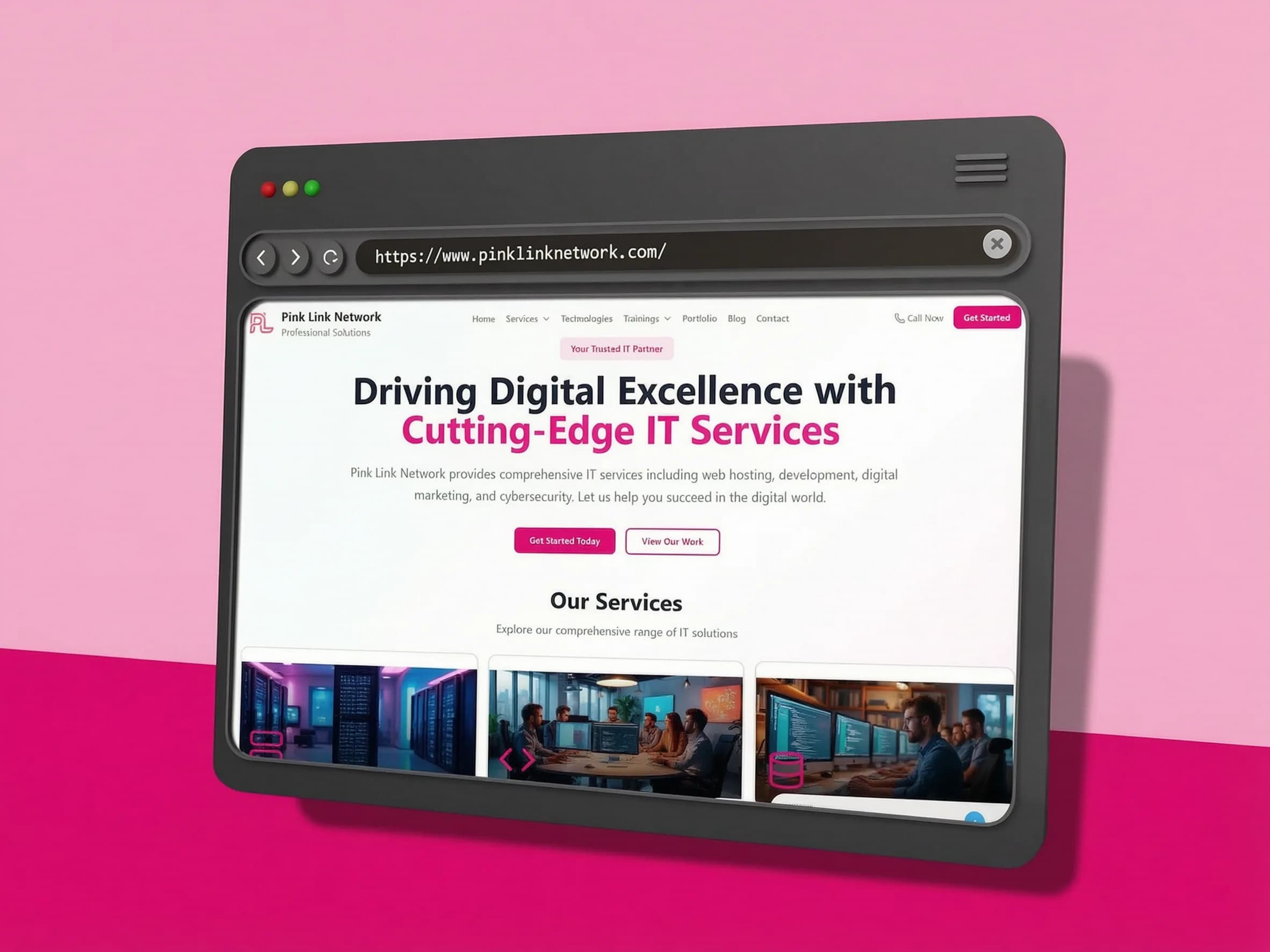
Project brief
From business need to delivered system
| Area | Project detail |
|---|---|
| Community need | A more approachable interface for discovering people, content, and participation paths. |
| Product response | A frontend organized around discovery, visibility, and repeat browsing. |
| Delivery result | A clearer community experience that could grow without losing visual consistency. |
Community need
A more approachable interface for discovering people, content, and participation paths.
Product response
A frontend organized around discovery, visibility, and repeat browsing.
Delivery result
A clearer community experience that could grow without losing visual consistency.
Stack used
The challenge
What Pink Link Network needed the build to solve
Community products need to support discovery, participation, visibility, and repeat browsing at the same time. The challenge was to make the interface feel active and useful while keeping the first actions understandable for someone arriving for the first time.
Project facts
| Project type | Front-End Build |
|---|---|
| Responsibility | UI/UX, frontend, backend, database, and ecommerce workflows |
| Coverage | Public storefront and private owner dashboard |
| Technology | Next.js, React, TypeScript, Tailwind CSS, MongoDB |
The approach
How I handled the Pink Link Network delivery
I made discovery the primary entry point and shaped the layout around the first useful action a visitor could take inside the network.
The UI/UX work separated member value, content visibility, and interaction areas so the page could feel active without becoming visually crowded.
Responsive patterns were built around repeated browsing, keeping important member-facing information visible across different screen sizes.
Reusable frontend structures were kept central so additional community material could be introduced without breaking the established rhythm.
System structure
The structure behind Pink Link Network
The delivery connected the user-facing experience with the underlying implementation, keeping the project clear to use and practical to maintain as its needs expanded.
Discovery entry
A clear first step into the network, content, and participation paths.
Community interface
Reusable member, content, and interaction patterns across responsive screens.
Repeat engagement
A browsing structure that supports returning users as the community grows.
What was delivered
The practical output of the build
| Area | Project detail |
|---|---|
| Discovery flow | Clearer entry points for browsing, finding value, and understanding participation. |
| Community frontend | Responsive interface implementation with reusable content and interaction patterns. |
| Visibility system | Improved hierarchy for member, content, and network-facing information. |
| Growth foundation | A flexible structure prepared for continued community content and participation. |
Discovery flow
Clearer entry points for browsing, finding value, and understanding participation.
Community frontend
Responsive interface implementation with reusable content and interaction patterns.
Visibility system
Improved hierarchy for member, content, and network-facing information.
Growth foundation
A flexible structure prepared for continued community content and participation.
Delivery coverage
The shape of the work
Discovery
Structured
Frontend
Complete
Visibility
Clearer
Growth
Ready
Technical implementation
What had to work behind the interface
The frontend used reusable discovery and content patterns so new community material could be introduced without breaking the page rhythm.
UI/UX decisions reduced cognitive load by separating member value, content visibility, and action areas into clearer interface roles.
Responsive layouts kept member-facing information accessible across screen sizes and supported a consistent repeat-browsing experience.
Tools used
| Next.js | Community-facing page structure and responsive delivery. |
|---|---|
| React | Reusable discovery, content, and interaction components. |
| TypeScript | More predictable component and data structure where used. |
| MongoDB | Flexible data foundation for community-oriented records where required. |
Outcomes
What the Pink Link Network delivery achieved
Pink Link Network received a more approachable frontend for discovery, visibility, and repeat browsing.
The interface made community value easier to understand without crowding the experience with competing actions.
The reusable structure created room for future content and participation growth.
Why this matters
Clearer community discovery.
Approachable frontend UX.
Better content visibility.
Reusable growth patterns.
Reference note
This case study focuses on the frontend, UI/UX, and community discovery work delivered for Pink Link Network. Private member, moderation, and engagement details are intentionally omitted.
Continue exploring
More ways to explore Pink Link Network.
Compare related case studies, understand the services behind this delivery, or start a conversation about your own build.
Next Step